Edge Lighting: LED Borderlight
- 4.6
- Rating
- 10.00M
- Installs
- Free
- Price
 Analysis by App-foxy
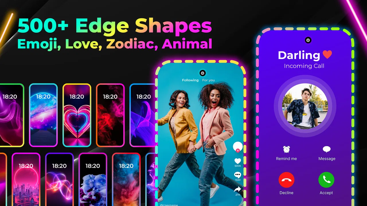
I spent time with Edge Lighting: LED Borderlight as a personalization app, focusing less on its colorful first impression and more on how it behaves during ordinary phone use. Its purpose is simple: add a glowing border around the display and use that visual treatment to make the screen feel more distinctive. That makes it appealing if your phone looks too plain, especially when you enjoy matching wallpapers, lock-screen styles, or notification-inspired lighting.
The app is developed by Maxlabs Personalization Tools and is free to install, with optional in-app purchases ranging from $2.99 to $39.99 per item. It is rated for Everyone, works on devices running Android 6.0 or later, and its current version is 540. Those details make it broadly accessible, although the experience can still vary considerably depending on the phone’s display shape, software skin, and how aggressively the device manages background activity.
How Edge Lighting feels in everyday use
The first thing I noticed is that the app is built around visual impact rather than deep phone automation. You choose an edge-lighting style, adjust the appearance to suit your taste, and use the result as a decorative layer over the screen. In practice, that means the app works best when you treat it as a finishing touch for your device instead of expecting it to transform the entire interface.
You May Also Like

 Blood Strike: 2.5 Anniversary
Blood Strike’s Loadouts Turn Every Drop Into a Tactical Gamble
A close look at Blood Strike’s custom loadouts: how fast access to signature weapons reshapes its battle royale rhythm, rewards preparation, and narrows the gap between fights.

 Pandora - Music & Podcasts
Pandora’s Music Is Easy to Start, but Harder to Recover
Pandora’s strength is its low-effort path from a seed to a station. Its weak spot is how much confidence it asks you to place in connection, setup, and quiet recovery.

 8 Ball Pool
 Is Built on Rivalries, Rematches, and Routine
A close look at the rivalries, rematches, shared routines, and unanswered safety questions that turn a quick pool match into a persistent mobile community.

 Samsung Music
’s Quiet Strength Is Playing What You Already Own
Its reach comes less from spectacle than from dependable access to a personal library. That simplicity is both the app’s strongest retention engine and its ceiling.

 AccuWeather: Weather Radar
AccuWeather Review: A Quick, Clear Forecast for Everyday Decisions
For everyday plans, the best forecast is the one you can understand quickly. AccuWeather makes rain timing, radar, and local conditions easy to act on, with a few trade-offs.

 Hill Climb Racing
Why Hill Climb Racing Still Turns Crashes Into One More Run
A tiny car, a bumpy hill and one more upgrade: Hill Climb Racing keeps resurfacing because its simple chaos makes every near-miss feel personal.
More From Our News Desk



Getting a pleasing result takes a little experimentation. A bright border can look attractive against a dark wallpaper, while the same effect may become hard to see on a busy or very light background. I found that a restrained color and a thinner-looking outline usually felt more polished than using every available visual effect at once. This is one of those apps where the best setup is often the one you notice briefly, not the one that dominates the display.
The store summary also highlights edge-screen live wallpapers, so the app is aimed at people who want more than a static border. That combination can give the phone a coordinated look, but it also means you should think about how the moving or glowing presentation fits your normal routine. A style that feels exciting during setup may become distracting when you are reading, working, or using the phone in a dark room.
Speed expectations during setup and normal use
From a perceived-speed perspective, the app feels like a visual customization tool rather than a demanding editor. The basic process of exploring styles and making changes is straightforward, and I did not approach it expecting the kind of instant, system-level response associated with built-in Android settings. The important distinction is that the app’s value comes from the final appearance, while the setup stage is where you spend most of your time making small visual decisions.
There is a practical reason not to rush. Changing colors repeatedly, switching between border designs, and testing the effect against different wallpapers can make the experience feel slower than it really is simply because you are comparing several combinations. I recommend choosing a wallpaper first, then adjusting the border around it. Doing this in reverse often leads to unnecessary tweaking because a color that looks excellent on the preview may blend into your actual home screen.
For a realistic example, imagine setting up a phone before a night out. I would pick a dark wallpaper, choose one accent color that matches the case or lock screen, and keep the border subtle. That workflow is faster and produces a cleaner result than browsing every option without a clear visual goal. The app rewards a little planning more than random experimentation.
What happens when the phone is under heavier use
The most demanding moments are likely to come from combining decorative lighting with other visually active phone tasks. If you are using a live wallpaper, playing a game, watching video, or keeping the display bright for a long period, the border effect becomes one more element competing for screen attention and device resources. I would not call that a reason to avoid the app, but it is a reason to use moderation.
My preferred heavy-use setup would be a static wallpaper with a restrained edge effect. It preserves the personality of the app without asking the phone to maintain too many moving visual elements at once. If you are particularly sensitive to warmth, battery use, or visual clutter, this is the first adjustment I would make before uninstalling the app.
Another useful habit is to create different looks for different situations rather than relying on one dramatic design all day. A brighter border can work when you are showing the phone to someone, while a calmer style is more comfortable for reading or using the device before sleep. This makes the app feel more practical and reduces the chance that its most noticeable effects become annoying.
I would also avoid judging performance from a single preview screen. A border may appear smooth while you are browsing the app but feel less appropriate once you return to ordinary phone tasks. The real test is whether the effect remains pleasant while switching between messaging, browsing, and media. In my experience, personalization apps succeed when they stay in the background; if I keep thinking about the effect itself, the design needs simplifying.
Reliability, persistence, and recovering from interruptions
Reliability matters more here than it might seem. A decorative effect is easy to enjoy when it is visible, but its usefulness drops quickly if it disappears after a restart, a software update, or a period of inactivity. Because Android devices handle background behavior differently, I would treat persistence as something to check on your own phone rather than assume it will behave exactly like the preview.
My practical advice is to test the setup across several ordinary situations: lock and unlock the phone, switch between portrait and landscape when relevant, restart the device, and return to the home screen after using another app. These simple checks tell you more than a long session inside the customization screen. If the border comes back consistently, you can use it with confidence. If it needs occasional reactivation, you will know that before depending on it as part of your daily layout.
Recovery is also easier when you keep your setup simple. If a complicated combination of wallpaper and lighting does not appear correctly, return to a basic border and a static background first. Then add visual elements one at a time. This isolates the source of the problem and avoids the common mistake of changing several settings at once, which makes it difficult to know what actually fixed the display.
The app’s broad adoption suggests that many people find its central idea worthwhile. It has passed over ten million installs, with an average rating of 4.6 from around eighty-nine thousand ratings and roughly one thousand one hundred written reviews. I see those figures as evidence of strong general appeal, not a guarantee that every phone will deliver identical behavior. Personalization software is unusually dependent on the hardware and operating system it is running on.
Device limits that can change the experience
The minimum requirement of Android 6.0 makes the app available to a wide range of devices, including older phones. That is useful if you are trying to refresh an aging handset without replacing it. At the same time, an older phone may have a less suitable screen shape, a slower graphics system, or more aggressive memory management than a recent model. The app can be compatible while still feeling less impressive on that hardware.
Display design is especially important. Phones with curved edges, punch-hole cameras, notches, unusually rounded corners, or thick software overlays may not present a border in exactly the same way as a conventional rectangular screen. I would check the result around the corners and near cutouts rather than judging only the center of the preview. A small alignment imperfection is more noticeable when the lighting is bright or animated.
Screen technology can influence the visual character too. On a dark display, colored lighting usually has more contrast and feels more deliberate. On a bright panel or under strong daylight, the same effect may look softer. This is not necessarily a flaw in the app; it is a reminder that the final appearance belongs to the combination of software, screen, brightness, and wallpaper.
Older devices may also benefit from a less ambitious configuration. If your phone already struggles when several apps are open, I would choose a static wallpaper and a simple border rather than a constantly active visual arrangement. That approach keeps the personalization useful while respecting the limits of the hardware.
Who will enjoy it, and who should skip it
I think this app is a good match for people who enjoy changing the look of their phone regularly. It is particularly appealing if you care about color coordination, want a more expressive lock-screen or home-screen presentation, or find standard Android personalization options too restrained. It can also be a nice way to make a familiar phone feel fresh without changing launchers or rebuilding the entire interface.
It is less suitable for someone who wants a completely quiet, distraction-free screen. If you prefer minimal battery use, dislike animated wallpaper, or expect customization to work invisibly without any maintenance, the extra glow may not justify the effort. I would also skip it if your phone has a very unusual display layout and you are unwilling to spend time checking the border around every corner.
Compared with built-in wallpaper and theme controls, Edge Lighting: LED Borderlight offers a more focused visual identity. System tools are usually better for changing several parts of the interface in one consistent package, while this app is stronger when the border itself is the feature you care about. Compared with a launcher, it is less disruptive: you do not need to replace the way you navigate the phone just to add a decorative edge.
That trade-off is important. A launcher can provide deeper control over icons, gestures, grids, and app organization, but it also changes daily habits. This app stays closer to the existing phone experience. If your goal is a glowing frame rather than a complete redesign, that narrower focus is a strength.
Small choices that make the result better
My first tip is to match the border to one color already present in your wallpaper instead of selecting a completely unrelated shade. This creates visual continuity and makes the effect look intentional. If the wallpaper contains several strong colors, choose the least dominant one; otherwise the border can compete with the image rather than frame it.
My second tip is to test the effect with brightness lowered. A design that looks balanced at maximum brightness may feel excessive in a dim room. This also gives you a better idea of whether the border is genuinely attractive or merely eye-catching because the screen is unusually bright.
Third, keep a simple fallback arrangement. I would remember one understated border and one plain wallpaper combination that looks acceptable on any day. If an update, restart, or device change makes the preferred style behave differently, you can return to that baseline quickly instead of starting the entire design process again.
Fourth, consider context before using a live wallpaper. Motion can make the phone feel more modern, but it is not automatically the best choice for reading, navigation, or long work sessions. A static background with a carefully chosen edge is often the more comfortable option, especially when you want the phone to look polished without constantly drawing your eyes toward it.
What the free version means in practice
The app is free to install, which makes it easy to try the core idea before deciding whether it belongs on your phone. Optional purchases are available from $2.99 to $39.99 per item, so I would explore the free experience first and only pay for a style if you know you will use it regularly. The wide range between the lower and higher purchase points is worth keeping in mind when browsing optional content.
I prefer this approach with personalization apps because visual preferences are personal. A feature that looks special in a preview may not fit your wallpaper, screen shape, or everyday habits. Trying the no-cost setup lets you evaluate the important questions: does the border line up well, does it remain comfortable during normal use, and does the phone still feel responsive enough for you?
The Everyone rating also makes the app approachable for a broad audience. In practical terms, that means it can suit a family member who wants a more colorful phone without introducing an unusually complicated type of content. Even so, I would still help less technical users with the initial setup, particularly if their device has strict background controls or a non-standard display.
My performance verdict after living with the effect
Edge Lighting: LED Borderlight succeeds because it has a clear purpose and does not require you to replace the entire phone interface. The strongest experience comes from treating it as a controlled accent: choose a compatible wallpaper, keep the lighting readable, and test the result through real tasks rather than relying only on the preview.
Its main limitations are tied to the nature of the feature. Bright or animated borders can become distracting, older or unusual devices may present the design less cleanly, and persistence can depend on how a particular Android phone manages visual services. Those are meaningful considerations, but they are manageable if you are willing to simplify the setup when necessary.
For me, the app is worth recommending to anyone who wants a more distinctive screen without committing to a launcher or a full theme overhaul. I would not recommend it to a strict minimalist or to someone seeking measurable performance improvements, because this is decoration rather than utility. But if a subtle glow around the display is exactly the kind of personal touch you enjoy, the best results come from restraint, compatibility checks, and a setup that remains pleasant after the novelty fades.
FAQs for Edge Lighting: LED Borderlight
01What is Edge Lighting: LED Borderlight and how does it work?
Edge Lighting: LED Borderlight is an app that enhances the visual appeal of your device by adding a customizable LED border around the screen. It works by overlaying a light effect on the edges of your screen, which can be tailored with different colors, patterns, and animations to suit personal preferences.
02Can Edge Lighting: LED Borderlight affect my device’s battery life?
While Edge Lighting: LED Borderlight is designed to be efficient, using animations and bright colors can lead to increased battery consumption. Users should monitor battery usage while using the app and adjust settings like brightness and animation frequency to mitigate any potential impact on battery life.
03Is Edge Lighting: LED Borderlight compatible with all devices?
Edge Lighting: LED Borderlight is compatible with most Android devices, but performance may vary depending on the device’s specifications and operating system. It's recommended to check the app’s compatibility on the Google Play Store and ensure your device meets the necessary requirements before downloading.
04Does the app require any special permissions to function?
Yes, Edge Lighting: LED Borderlight may require permissions to overlay on other apps, access notifications, and modify system settings. These permissions are necessary for the app to display the lighting effects properly and respond to incoming notifications effectively.
05Can I customize the colors and patterns of the edge lighting?
Absolutely! Edge Lighting: LED Borderlight offers extensive customization options. Users can choose from a variety of colors, patterns, and animation speeds to create a unique look. The app also allows you to set different lighting effects for specific apps or notifications, enhancing personalization.
Pros
- Customizable lighting effects
- Battery-efficient operation
- Supports all screen sizes
- Easy to set up and use
- Enhances phone aesthetics
Cons
- Limited free features
- May not work on older devices
- Ads in the free version
- Occasional app crashes
- Requires permission access

Edge Lighting: LED Borderlight
Gallery